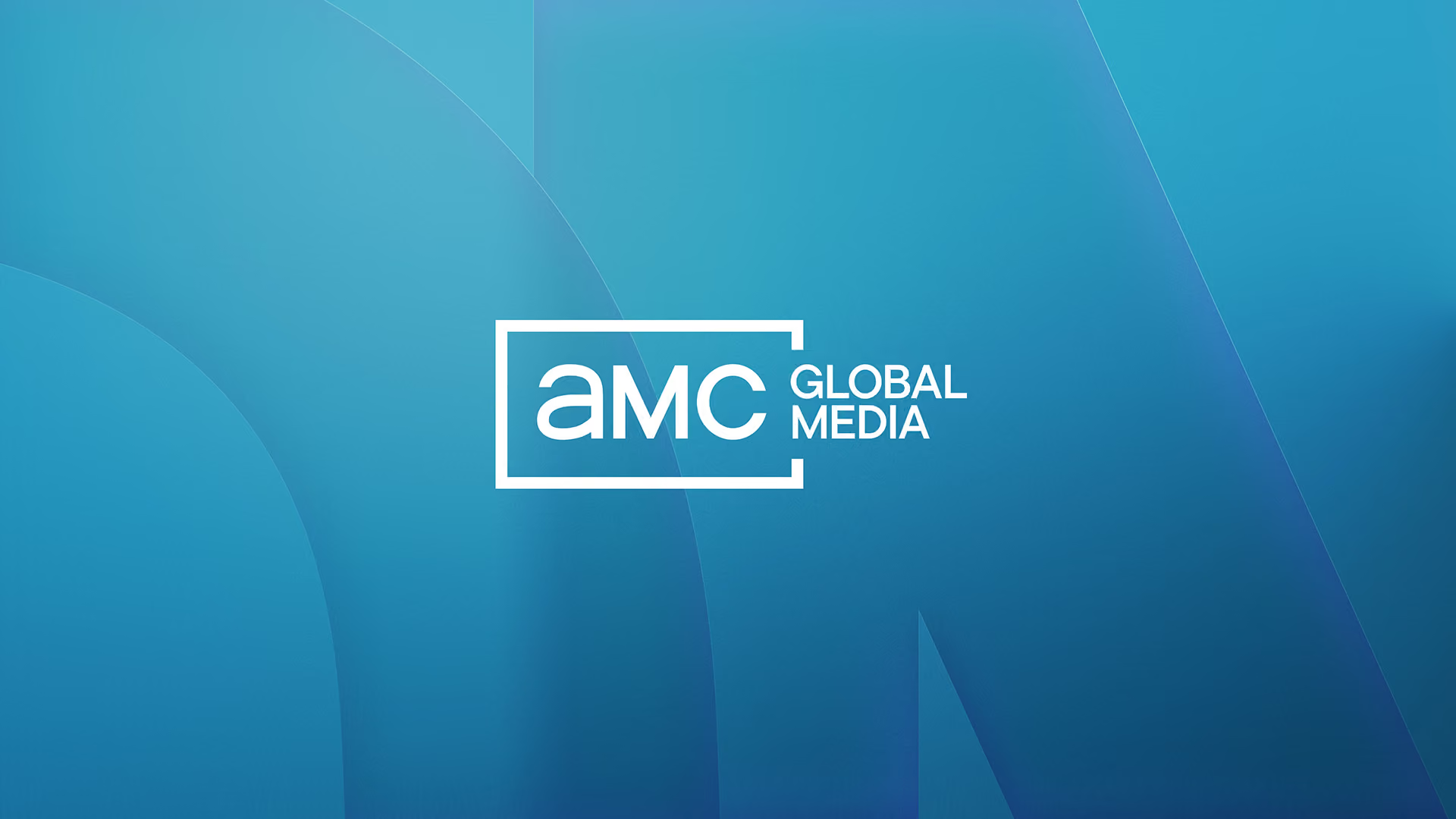
AMC Global Media changed its name to reflect what the company has become: a content first entertainment brand built on genre defining storytelling, not a traditional media conglomerate. The new name demanded a corporate identity to match. The logo carried decades of equity, so the new system had to honor it while becoming modern and flexible enough to represent a portfolio spanning networks, streaming services and studios.





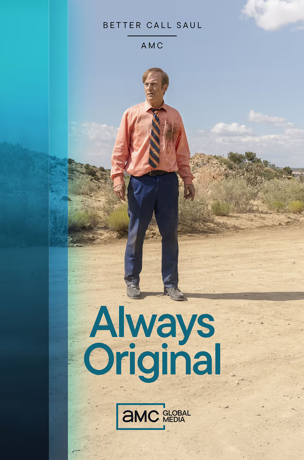
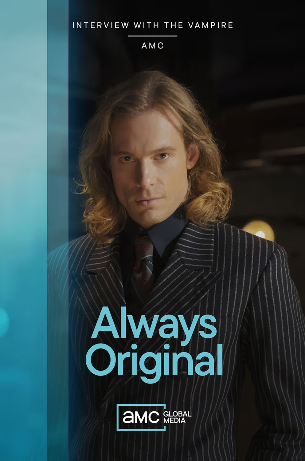
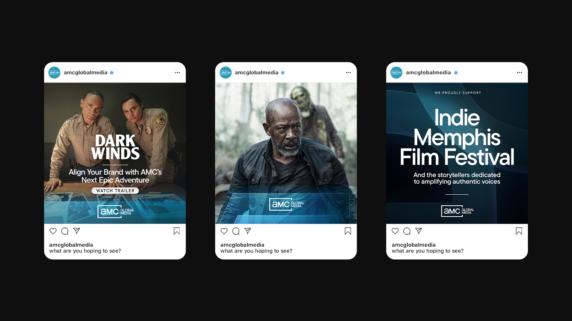
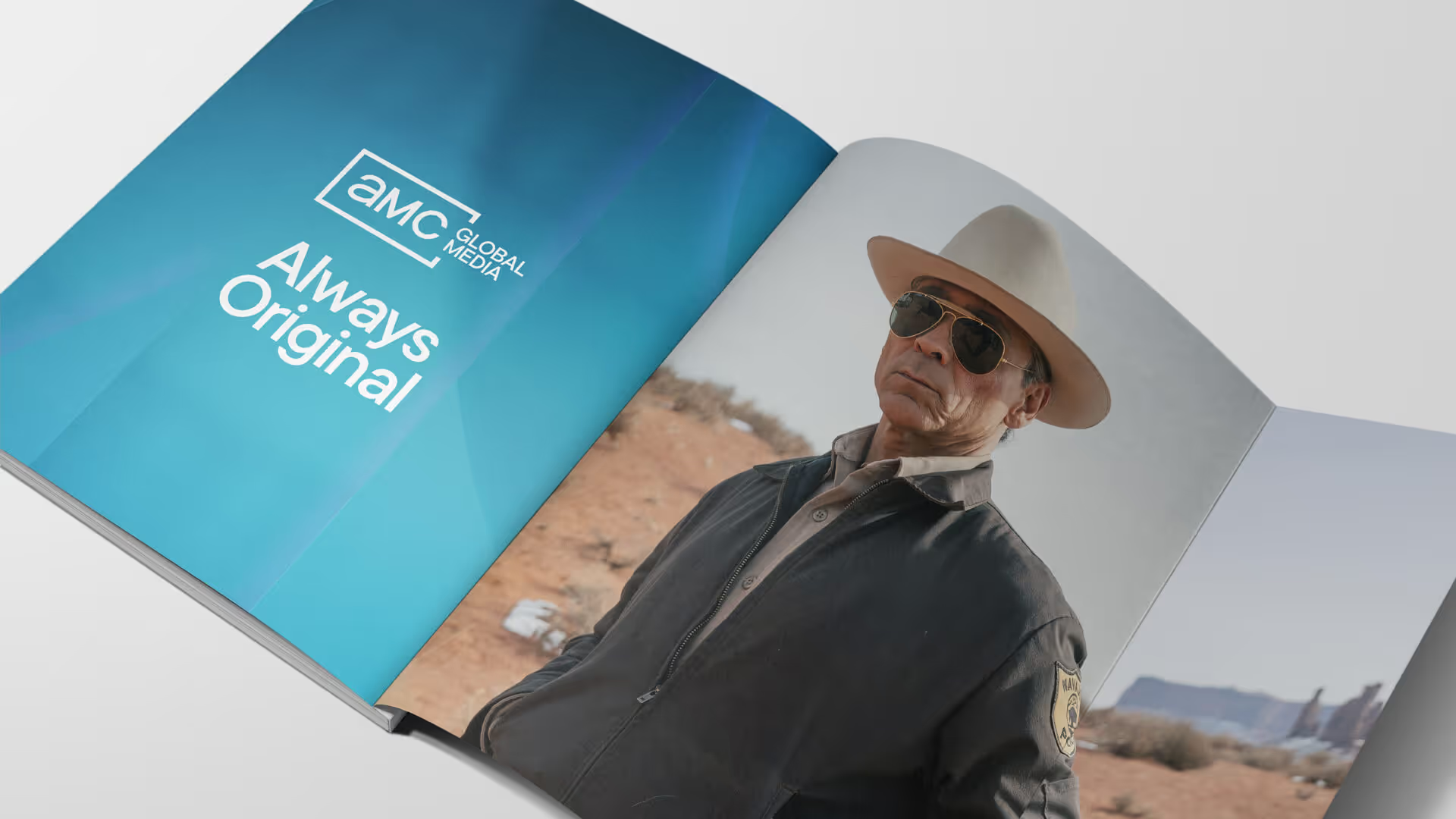
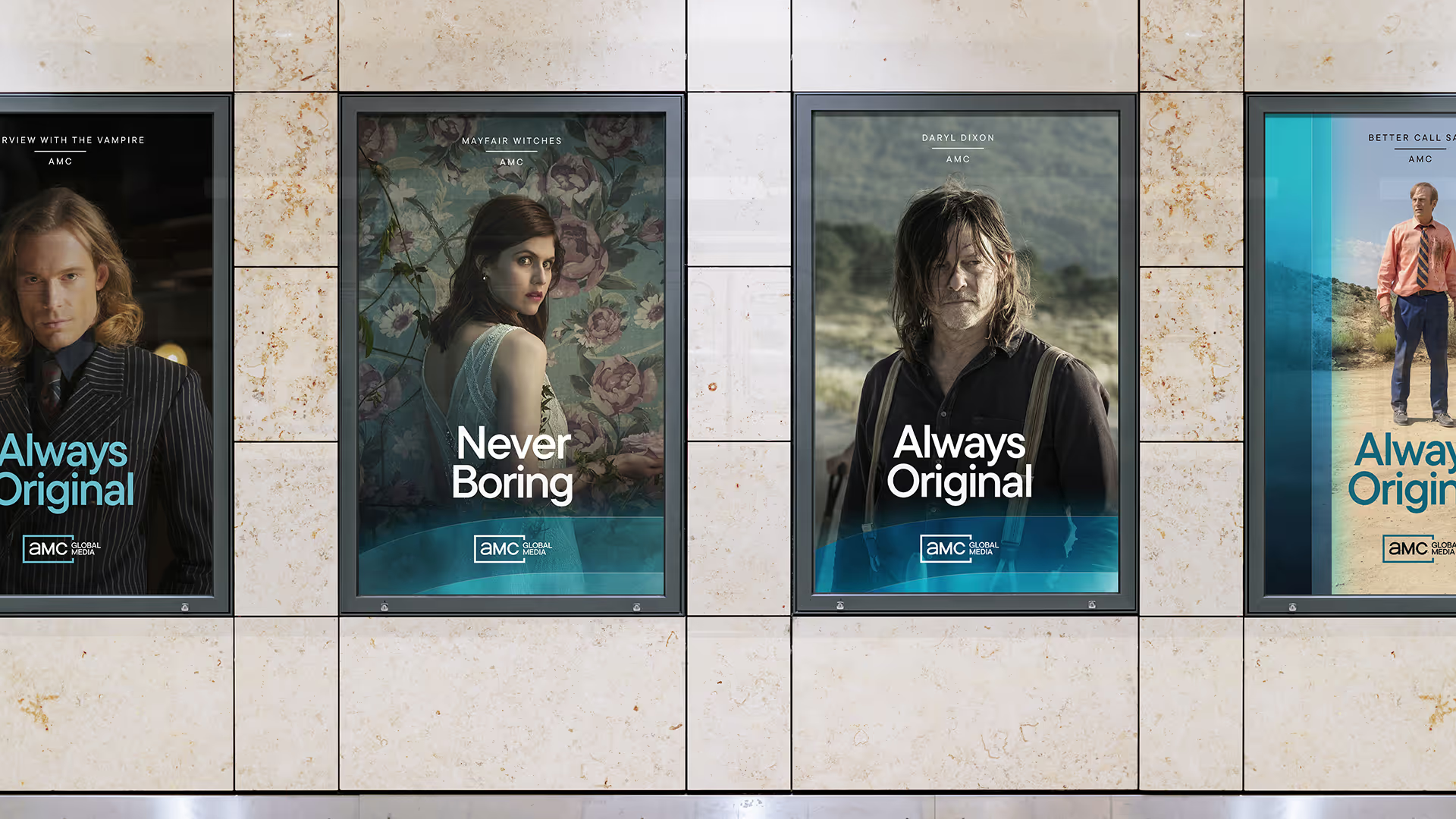
The content is the hero. Rather than competing for attention, the AMC identity is woven directly into the storytelling experience. The letterforms are reimagined as large scale colored glass elements that interact with imagery through light, transparency, and reflection, reinforcing brand recognition through presence rather than prominence. Beneath that surface, the geometric structure of the mark anchors the layouts and grids across the brand, so every application is built from the identity itself.