
Ken Burns, Sarah Burns, and David McMahon take audiences inside the mind of a genius in Leonardo da Vinci, a two part PBS documentary on the polymath's contributions to art and science. The brief covered title design, archival treatments, and typography. The challenge was designing in the shadow of one of history's greatest visual thinkers: the system had to feel worthy of its subject without imitating him.


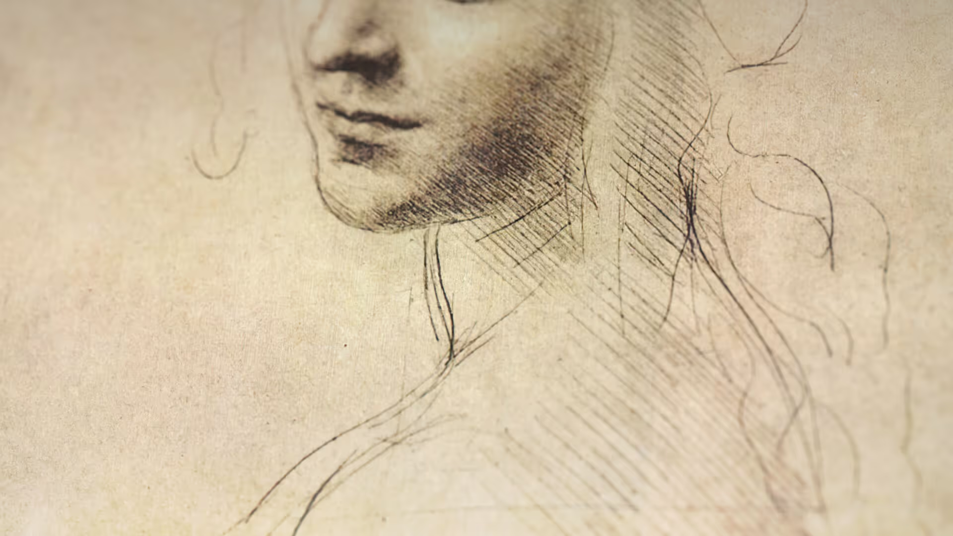
Da Vinci's own art and notebooks are the foundation. His thought processes are visualized through fine line work suspended in dark, infinite space, evoking ideas forming out of the void. The minimal yet intricate approach mirrors the precision of his sketches while feeling universal and timeless.

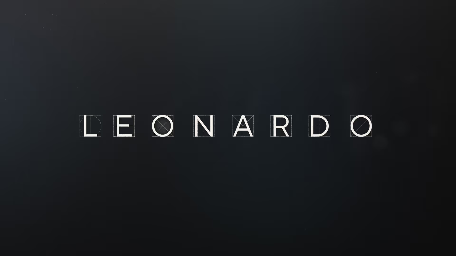


Chapter cards and episode titles use oversized serif type set within a strict grid, inspired by da Vinci’s architectural schematics. Each title reflects the precise symmetry and fine line work of his notebooks, as if drafted by hand.


