
SundanceTV presents a curated mix of original series and classic programming with lasting cultural relevance. The brief was a cohesive on-air identity reflecting the timeless quality of the content. The challenge was building a system designed for longevity: a look that rewards repetition rather than wearing out.


The identity is built around the tagline "Take Another Look," an invitation to rediscover classic programming. Distinctive typography, dynamic color, and creative framing reinforce the message, while a design language of familiarity and repetition creates a considered framework that strengthens with use.


The Network was named after Robert Redford's character in Butch Cassidy and the Sundance Kid. The brand package takes inspiration from the epic landscapes of the Southwest


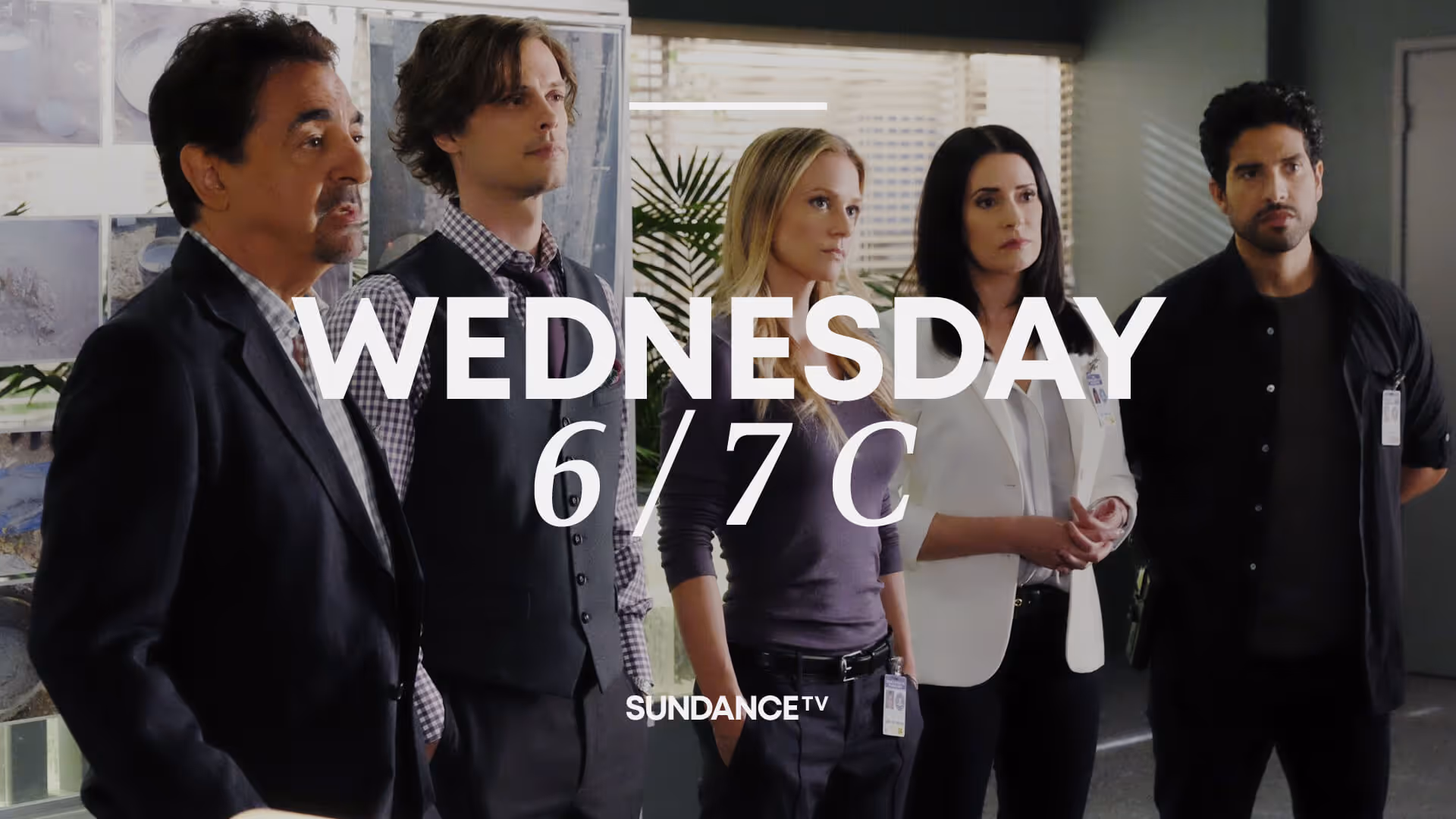

End pages feature oversized typography for the show name or message, cropped by imagery and tune-in details, with times and days in Cheltenham font.


